Tata CLiQ · Homepage
A homepage with endless customisation
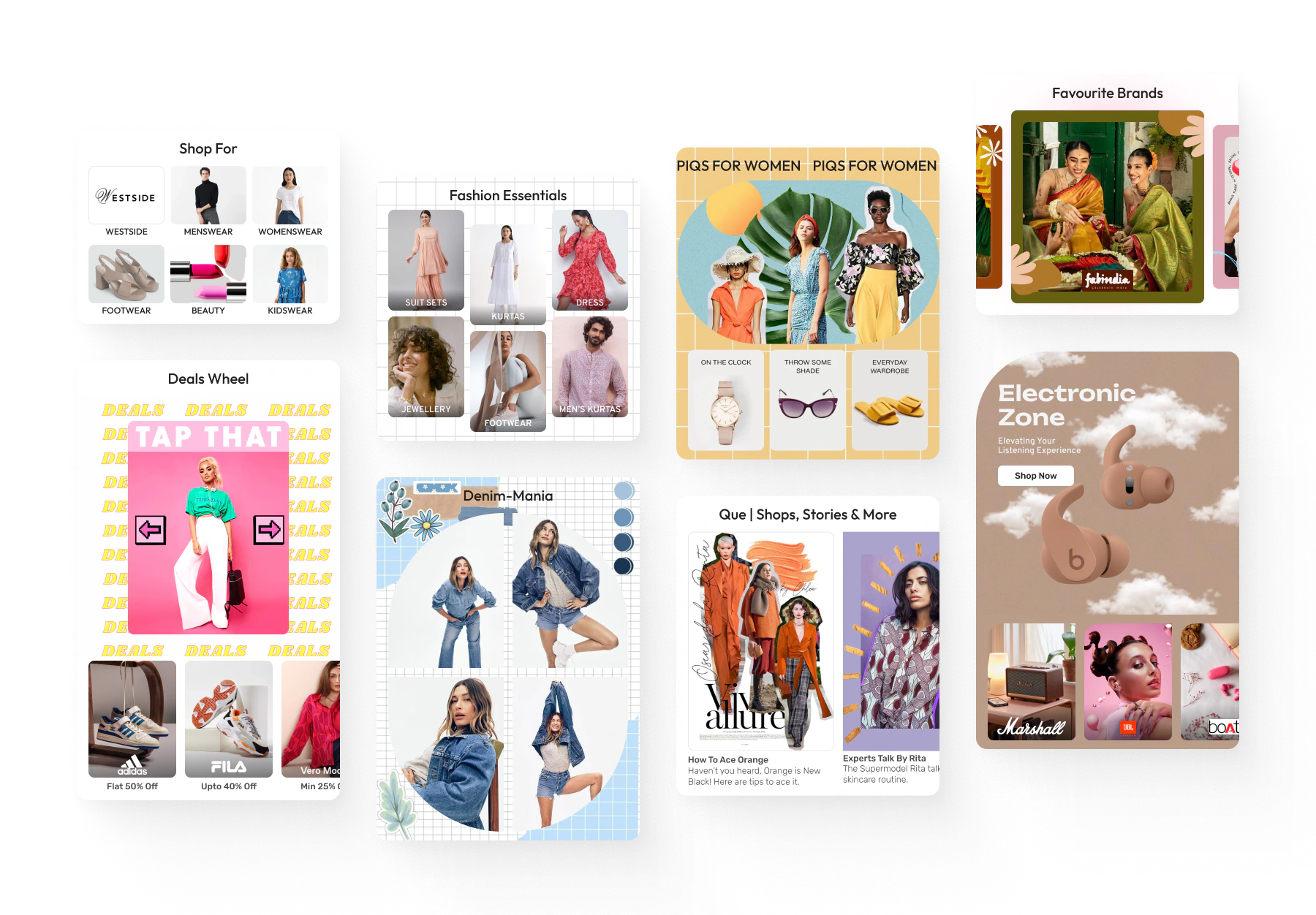
The homepage ran on makeshift components that broke across screen sizes. I designed a modular component system with dev and creative guidelines, so the creative team could launch fresh looks for every sale without the layout bugs.
-
+15%
homepage engagement on mobile
-
10+
specialised homepage components
-
25+
e-commerce apps and sites benchmarked
Context
Problem statement
The homepage is often the first thing visitors see. It sets the tone for their whole experience, and plays a pivotal role in shaping user experience, driving sales and building a strong online presence.
- The homepage was typically handled by the creative and marketing teams, with little to no involvement from product design
- There were no specialised components or guidelines, so the creative team used makeshift workarounds that came with a lot of compromises
- Spacing, padding and scaling issues appeared on devices with different screen widths and aspect ratios, because the existing components weren’t built responsively
Approach
The solution
- Develop a set of versatile, modular components that allow complete customisation of the homepage and solve the problems above
- Empower the creative team to implement great designs and give the homepage a fresh, unique look for sales and festive seasons, without the old issues
My role
What I did
- Audited the homepage and merchandising pages on CLiQ to understand the extent of the issues and where things were going wrong
- Benchmarked 25+ e-commerce apps and websites with the team to understand how they pull off creative layouts with their components
- Created highly modular, scalable homepage components with granular control
- Led design planning and component prioritisation, and aligned implementation logic with product and dev, handling complexity in code so configuration stays simple
- Wrote detailed dev and creative guidelines to ensure consistency and set a visual design language
The system
Meet the components
Nine components cover every homepage layout. Pick one to see how it works.
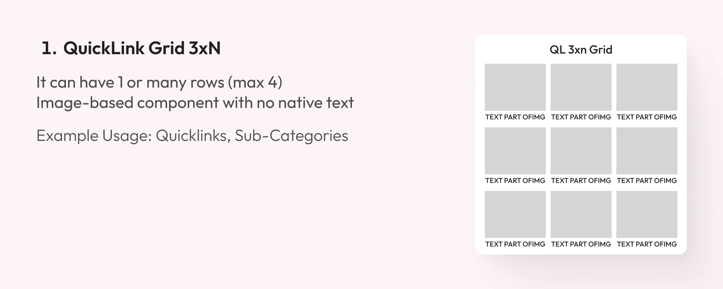
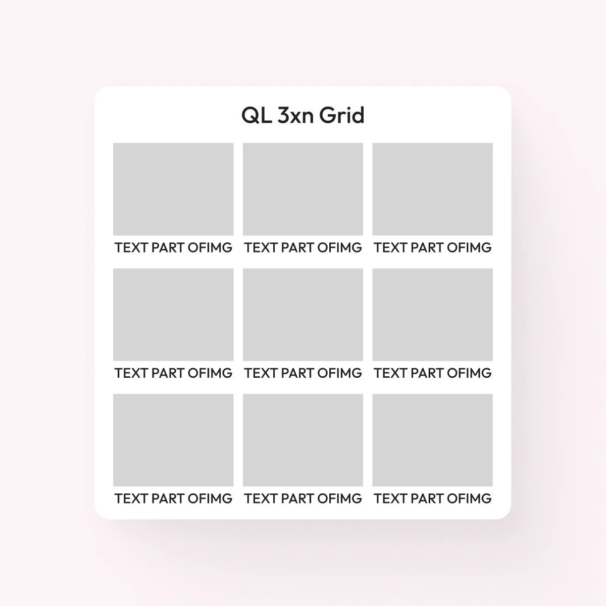
1. QuickLink Grid 3xN
- It can have 1 or many rows (max 4)
- Image-based component with no native text
Example usage: quicklinks, sub-categories
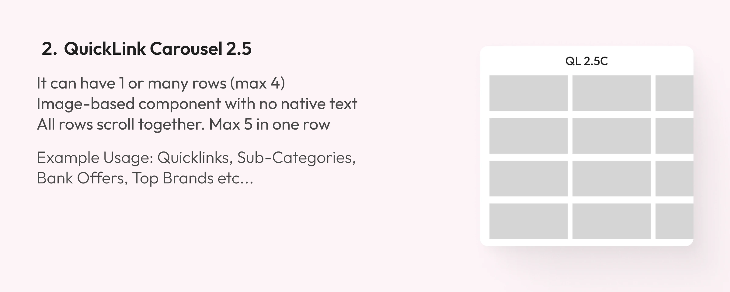
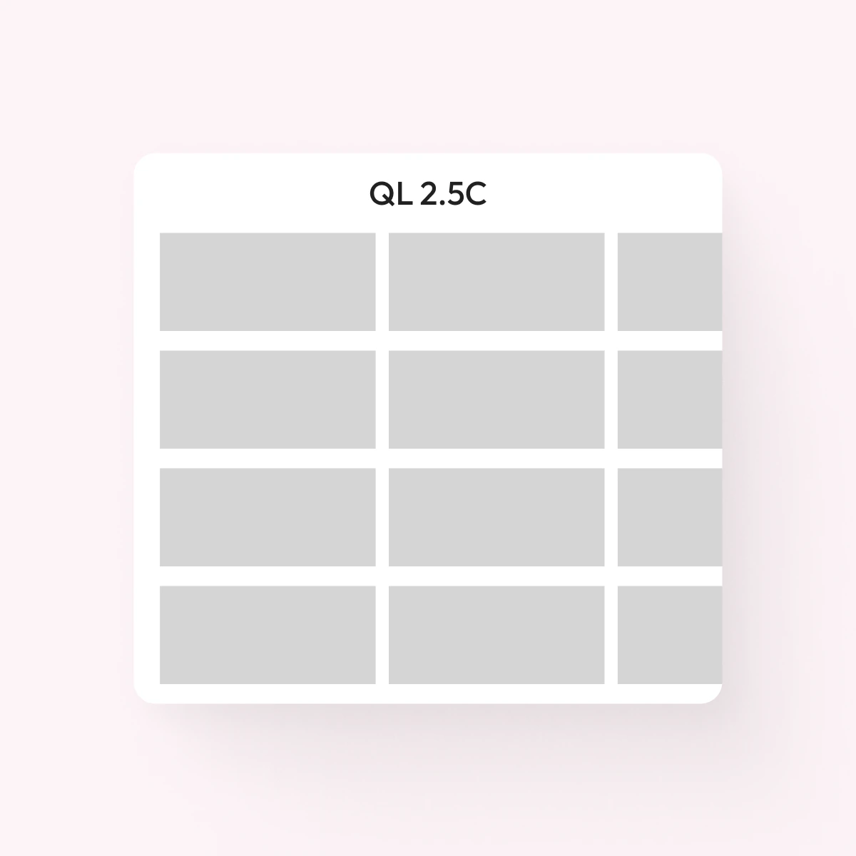
2. QuickLink Carousel 2.5
- All rows scroll together. Max 5 in one row
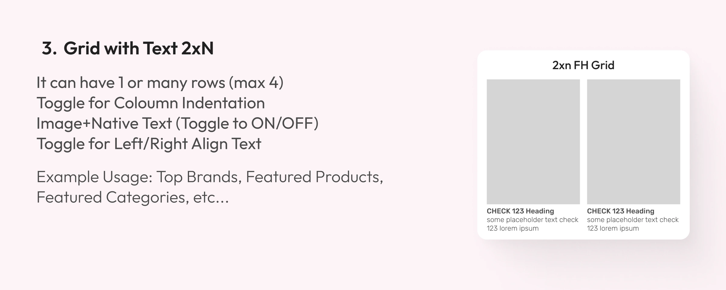
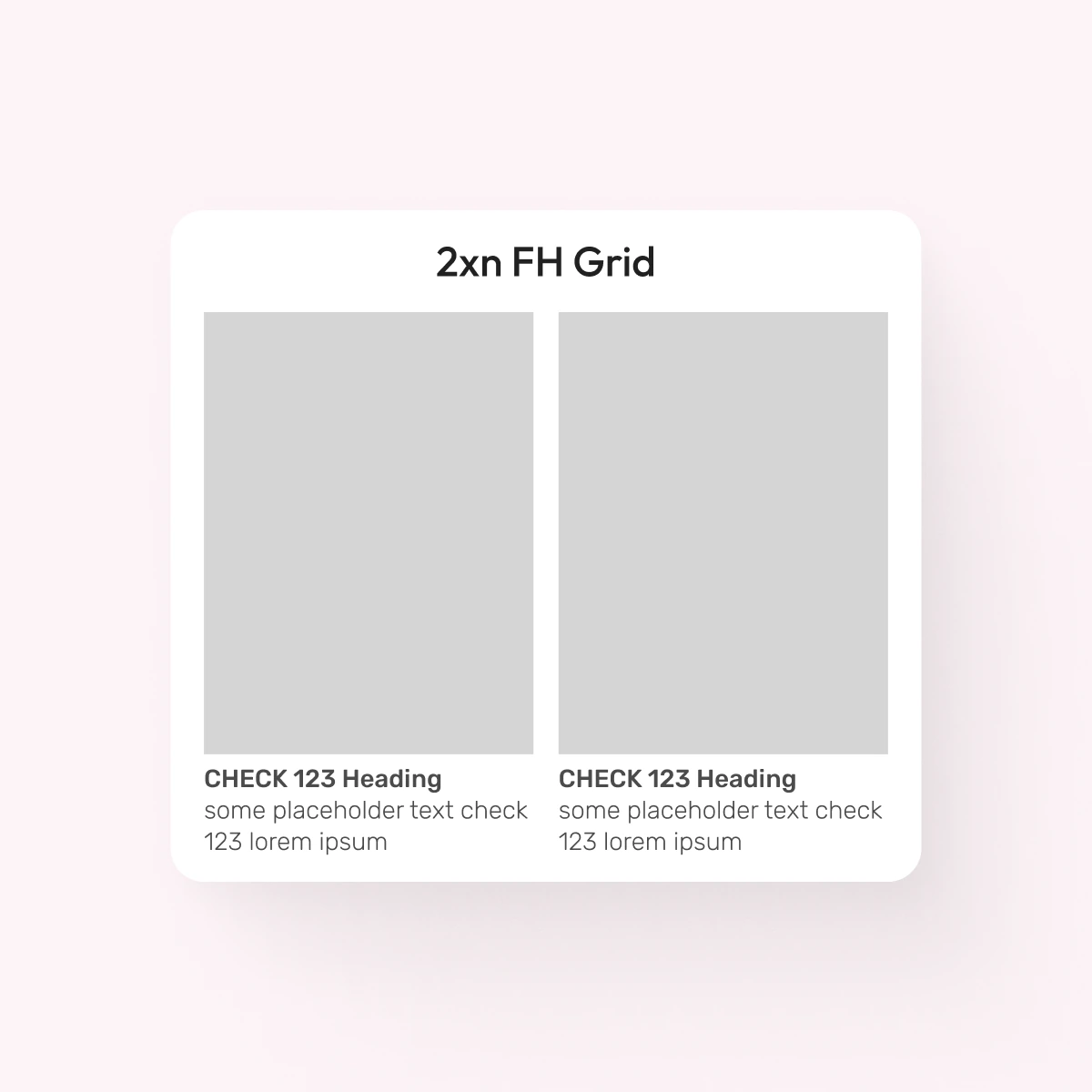
3. Grid with Text 2xN
- Toggle for column indentation
- Image + native text (toggle on/off)
- Toggle for left/right-aligned text
Example usage: top brands, featured products, featured categories
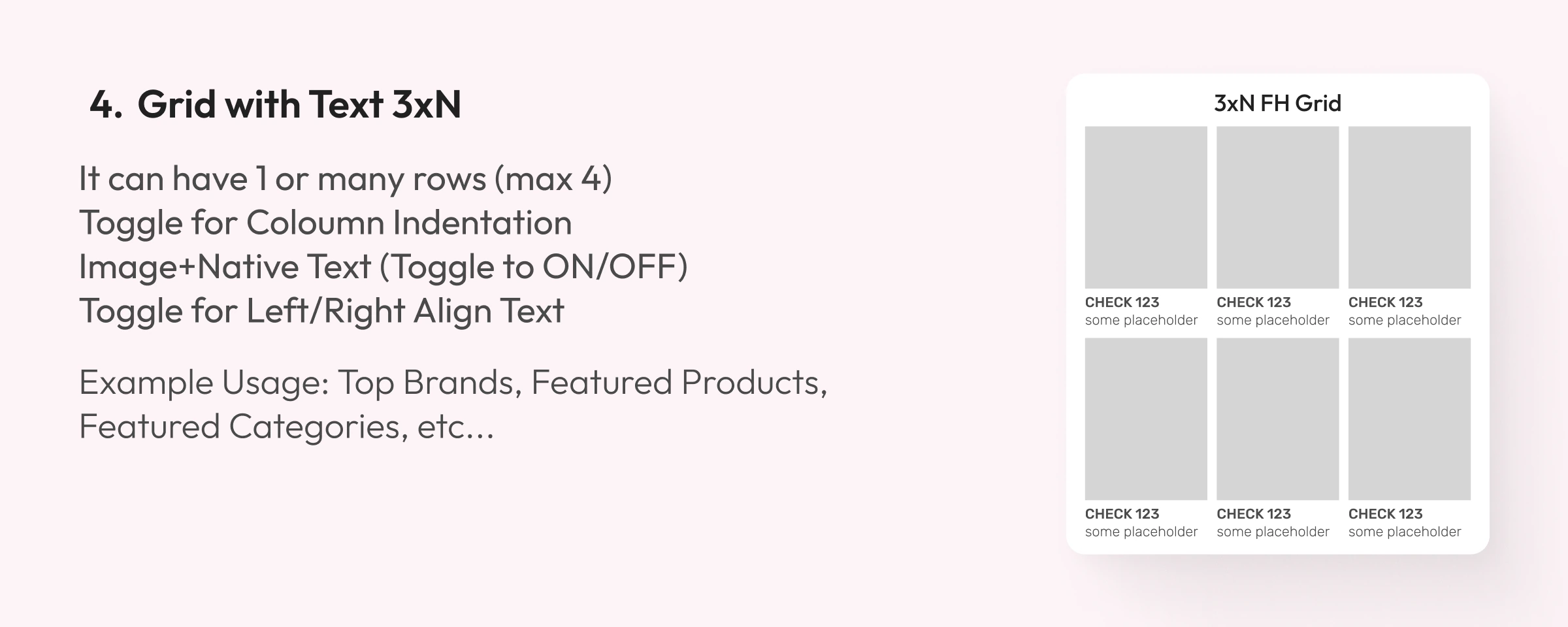
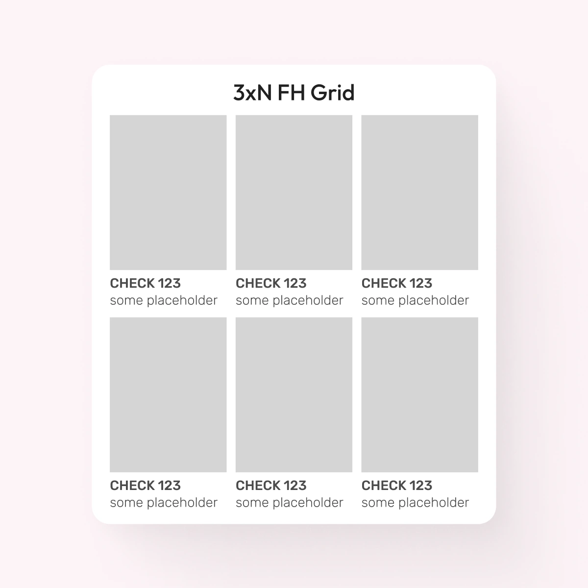
4. Grid with Text 3xN
- Toggle for column indentation
- Image + native text (toggle on/off)
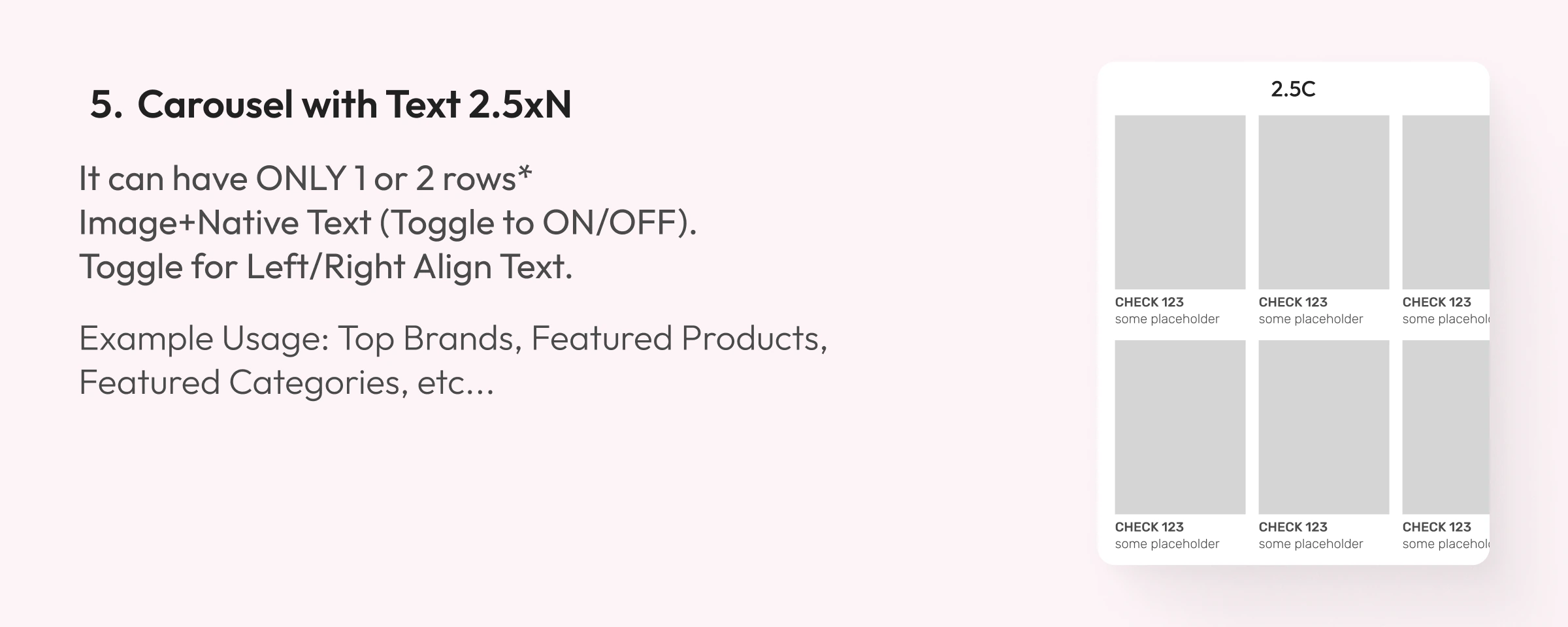
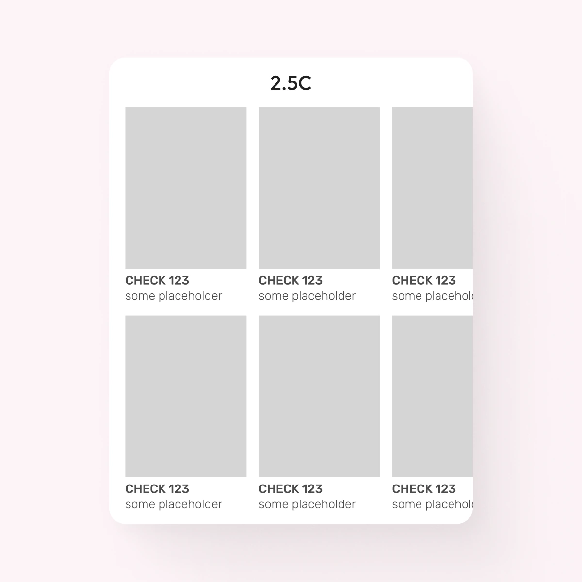
5. Carousel with Text 2.5xN
- It can have only 1 or 2 rows
- Image + native text (toggle on/off)
- Toggle for left/right-aligned text
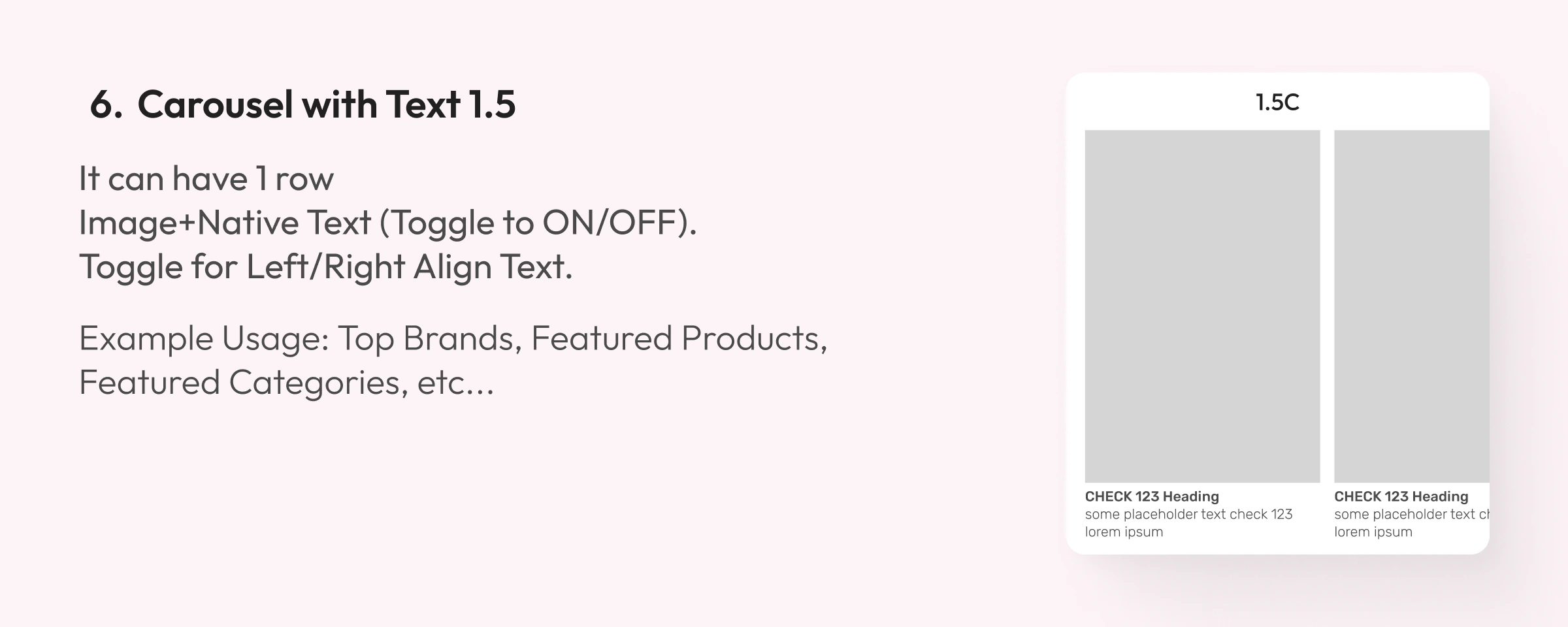
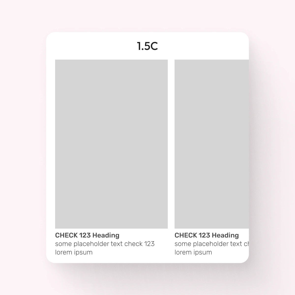
6. Carousel with Text 1.5
- It can have 1 row
- Image + native text (toggle on/off)
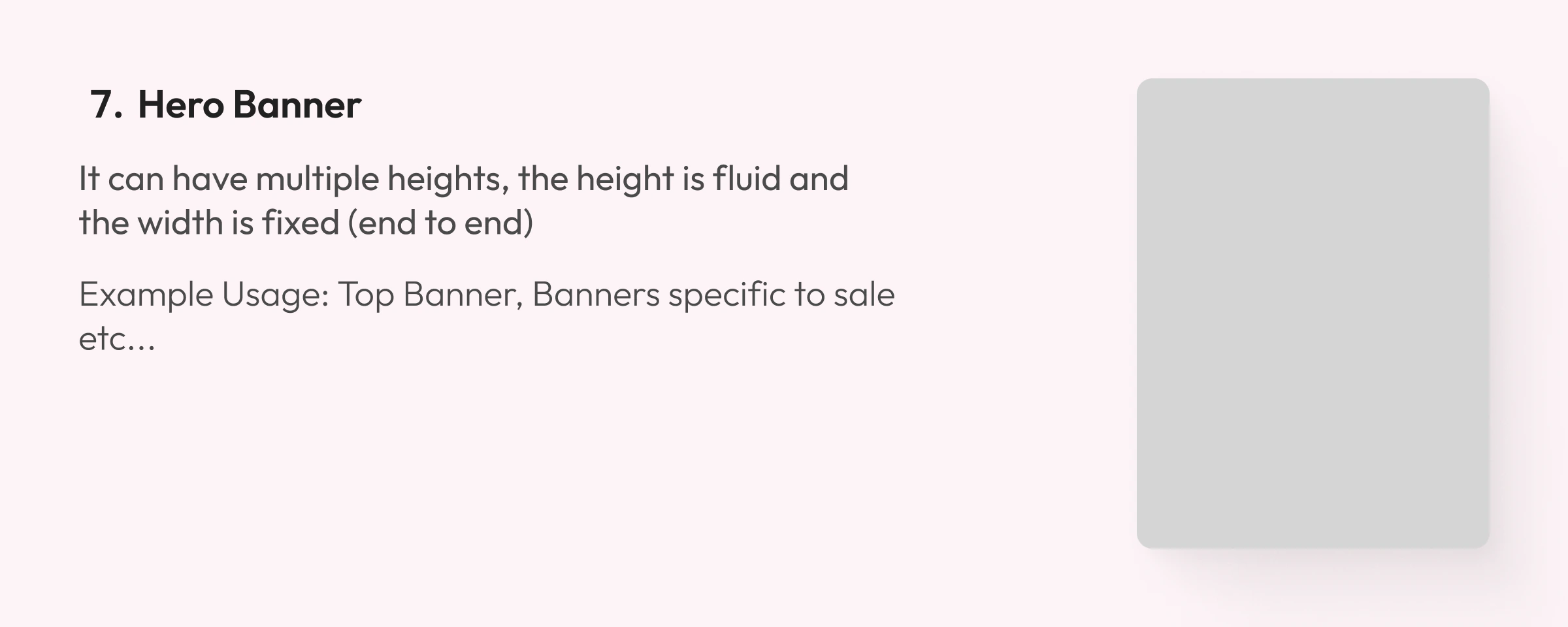

7. Hero Banner
- Fluid height, fixed full-bleed width
Example usage: top banner, sale-specific banners
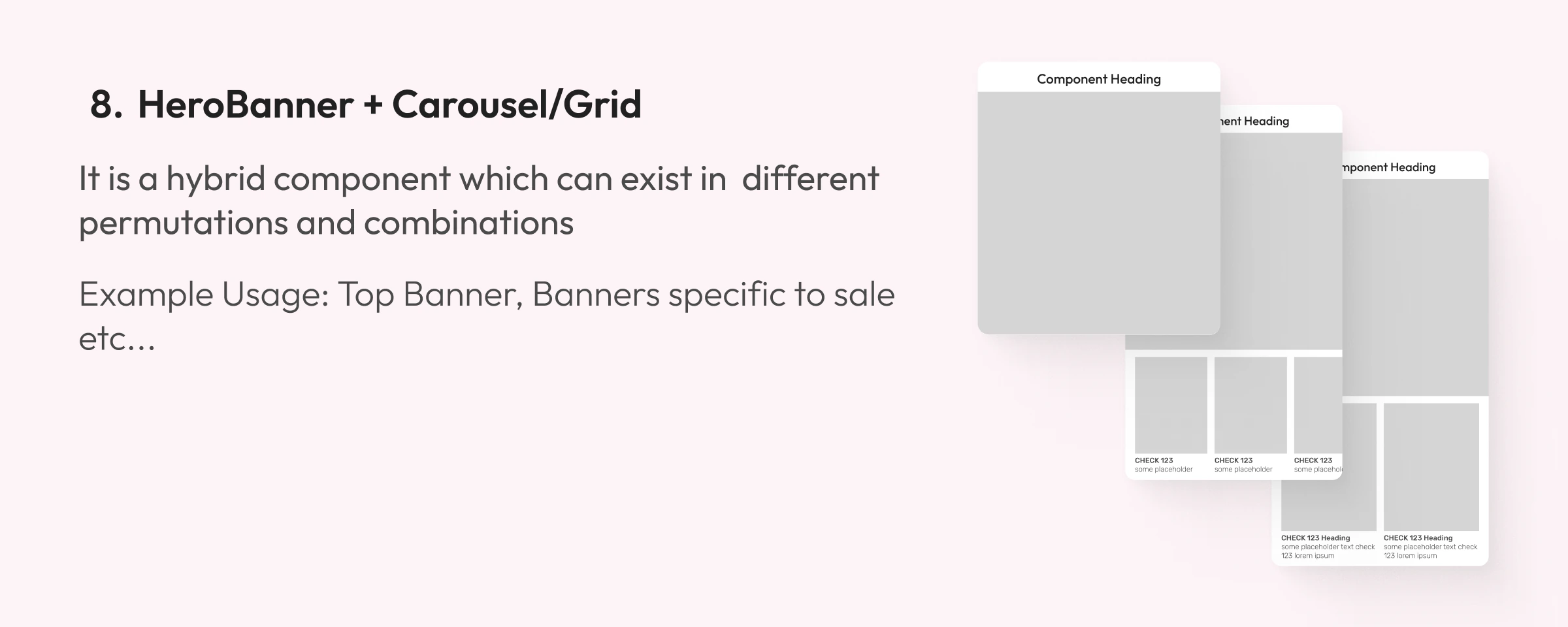
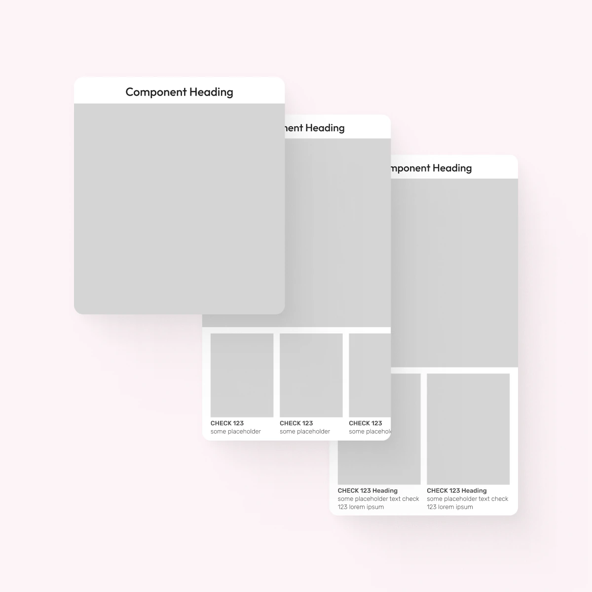
8. HeroBanner + Carousel/Grid
- A hybrid component that works in different permutations and combinations
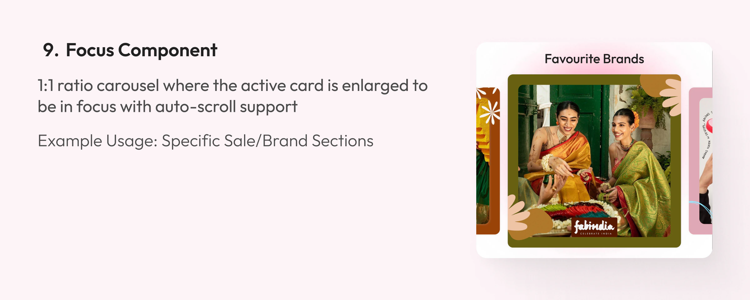
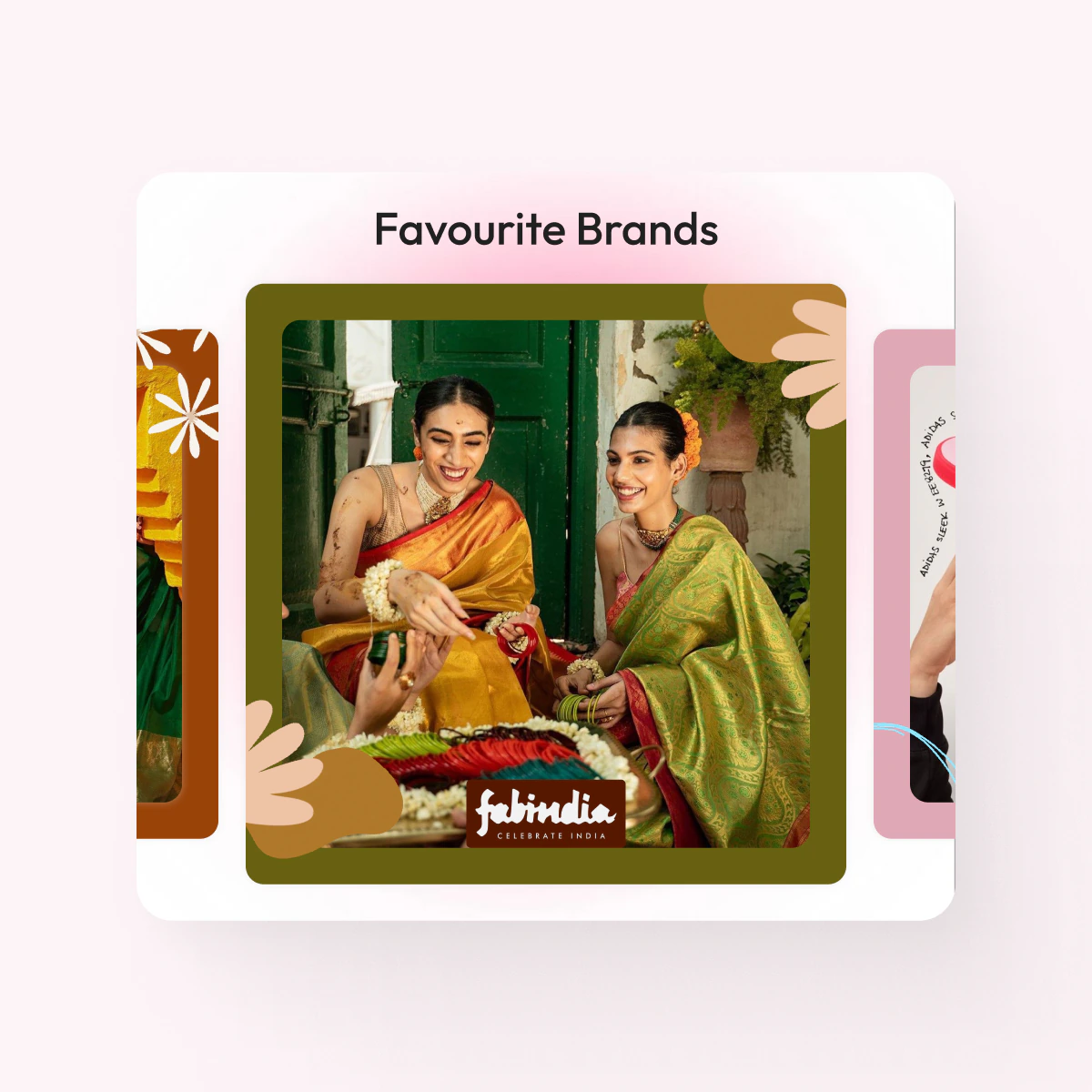
9. Focus Component
- 1:1 carousel where the active card is enlarged into focus, with auto-scroll support
Example usage: specific sale or brand sections
Details
Component properties
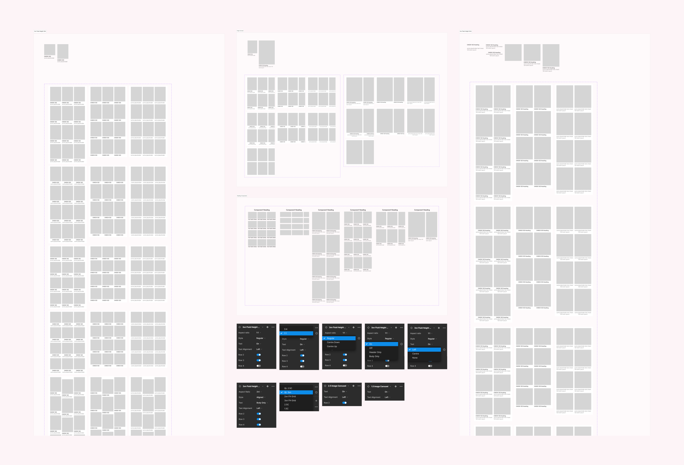
- Designed to be highly scalable and versatile
- All spacing and padding between elements is defined inside the components
- Custom image and GIF support at both the image-container and component level
Result
Outcome and impact
- Created 10+ specialised components, with creative and dev guidelines so homepage designs ship as intended
- Resolved spacing, padding and scaling issues for responsive design
- +15% homepage engagement across mobile devices after shipping the new components